We’re letting you know that this post contains sponsored links which Your Savvy Purse receives compensation for, which may impact their order of appearance.
We have all experienced that specific, baffling moment in a clothing store dressing room. You spot a sweater on the rack in a rich, trending shade—perhaps a muted mustard yellow, a vibrant fuchsia, or a deep, moody olive green. On the hanger, the color looks sophisticated and high-vibe. But the moment you slip it on and look into the mirror under the harsh dressing room lights, your heart sinks.
Suddenly, your skin looks washed out, tired, or slightly sallow. The dark circles under your eyes appear magnified, and your natural features seem to recede into the background. You haven’t changed your skincare routine or lost sleep, yet the garment makes you look instantly exhausted.
Conversely, we all have that one “magic” shirt in our closet. It might be a simple, unassuming navy blue or a soft dusty rose, but every time you wear it, people stop to tell you how radiant, rested, and vibrant you look.
The difference between these two scenarios has absolutely nothing to do with the price tag of the clothing, the fabric composition, or the fit. It is governed entirely by the rules of personal color analysis.
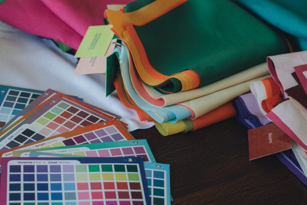
In the modern fashion and wellness space, figuring out your color season has become a massive, heavily monetized trend. Social media feeds are flooded with viral videos of professional stylists charging anywhere from $200 to $500 for a single, one-hour color consultation. They drape clients in various fabric swatches under customized studio lighting to determine if they are a “Soft Autumn,” a “Bright Spring,” or a “Cool Winter.”
While the results of a professional analysis are undeniably high-yield, spending a significant portion of your wardrobe budget just to be told what colors to buy feels counterintuitive.
True sartorial resourcefulness means knowing how to view your own biology through a lens of artistic strategy. You do not need an expensive appointment, a subscription-based mobile app, or a professional lighting setup to unlock your flattering color palette.
Your skin, eyes, and natural hair contain all the data required to decode your seasonal color identity.
This comprehensive, step-by-step manual breaks down the precise scientific variables of color theory and maps out a zero-cost protocol to analyze your undertones, value, and chroma right at home in front of your own mirror.
1. The Science of Harmony: The Three Pillars of Color Theory
To successfully execute a DIY color analysis, you must first throw away vague descriptions like “warm-toned” or “cool-toned” and master the three core dimensions of human coloring: Hue, Value, and Chroma. Personal color analysis is rooted in the principle of visual harmony; your clothing should replicate the identical structural characteristics that already exist naturally in your skin, hair, and eyes.
- Hue (Temperature): This measures the underlying pigment of your skin’s canvas. A Warm hue means your skin is anchored by golden, yellow, or peach undertones. A Cool hue means your skin is anchored by blue, pink, or rosy undertones.
- Value (Depth): This measures how light or dark your overall features are. A High Value appearance features a lot of lightness (pale skin, blonde hair, light blue eyes), while a Low Value appearance features a lot of depth (deep espresso skin, dark brown hair, dark eyes).
- Chroma (Clarity): This measures the saturation and sharpness of your features. Bright coloring is clear, high-contrast, and striking (think sparkling, jewel-like eyes and high contrast between hair and skin). Muted coloring is soft, blended, and desaturated, featuring a gray or earthy undertone that ties the hair, skin, and eyes together seamlessly.
2. The 3-Step DIY Identification Protocol
To ensure absolute accuracy, you must set up a clean, controlled environment. Wait for a bright, overcast morning. Wash your face completely to remove any makeup, cover your hair with a neutral white towel if it is artificially dyed, and stand directly facing a window to capture pure, indirect natural daylight.
Step 1: The Veins, Gold, and Paper Undertone Test (Hue)
To find out if you are Warm or Cool, we look past your surface skin tone (which can change with a sunburn or tan) and analyze your cellular undertone.
- The Vein Check: Look closely at the veins on the inside of your wrists under natural light. If they appear distinctly blue or purple, your hue is Cool. If they look greenish or olive, your hue is Warm. If you cannot tell, you may be Neutral.
- The White Paper Contrast: Hold a pristine sheet of stark white printer paper directly next to your bare neck and chest in the mirror. If your skin looks cast in a pink, rosy, or blue light against the paper, you are Cool. If your skin looks golden, yellow, or creamy against the paper, you are Warm.
- The Jewelry Test: Grab a piece of shiny silver jewelry and a piece of yellow gold jewelry. Hold them over the back of your hand. Silver will make Cool skin look bright and uniform, while making Warm skin look slightly gray. Gold will melt into Warm skin like a seamless highlight, while making Cool skin look red or irritated.
Step 2: Evaluating Your Structural Contrast (Value)
Take a black-and-white selfie on your smartphone under natural window light. Look closely at the grayscale gradient of your face.
- If your hair, eyes, and skin all translate to a very similar shade of light gray or medium gray, you have Low Contrast.
- If your skin translates to bright white while your hair and eyes register as pitch black, you have High Contrast. High contrast points to Winter or Spring; low, blended contrast points to Summer or Autumn.
Step 3: The Household Fabric Drape (Chroma)
Go to your closet, kitchen, or linen closet and gather four specific solid color items: a bright optic white towel, an off-white or cream blanket, a heather gray t-shirt, and a stark black shirt. Hold them under your chin one by one.
- The Muted Test: If the soft heather gray shirt makes your eyes pop and your skin look even, but the stark black shirt makes you look ghostly and erased, your chroma is Muted.
- The Bright Test: If the crisp optic white and solid black items make your features snap into sharp focus, but the heather gray makes you look muddy and dull, your chroma is Bright.
3. The Four-Season Selection Matrix
Once you collect your data points, you can map your coordinates directly into the classic four-season matrix to unlock your ultimate color family:
| Your Hue (Temperature) | Your Chroma (Clarity) | Your Matching Season | Your Ultimate Power Colors |
| Cool | Bright / High Contrast | ❄️ Winter | Royal Blue, Emerald Green, Stark Black, Fuchsia |
| Cool | Muted / Low Contrast | ☀️ Summer | Powder Blue, Lavender, Soft Sage, Dusty Rose |
| Warm | Muted / Low Contrast | 🍁 Autumn | Olive Green, Burnt Orange, Mustard, Terracotta |
| Warm | Bright / High Contrast | 🌸 Spring | Coral, Bright Turquoise, Apple Green, Warm Gold |
If you are a Winter, your canvas requires high-saturation, icy tones to look alive. If you are a Summer, you thrive in the soft, smoky, and romantic pastel spectrum. Autumns look magnificent in rich, earthy, and sun-baked shades, while Springs glow effortlessly in bright, clear, and warm tropical hues.
Final Thoughts
Mastering your personal color analysis at home is one of the highest-yielding acts of style resourcefulness you can practice. It is a powerful daily reminder that fashion is not about buying every passing micro-trend or spending hundreds of dollars to have an expert validate your appearance. True style is born from self-knowledge and visual harmony. By learning how to analyze your own undertones, contrast, and clarity, you take complete authority over your consumer habits.
You stop wasting money on garments that drain your energy, streamline your morning routine down to a few confident choices, and construct a functional, beautiful wardrobe that highlights your natural vitality every single day, completely on your own terms.